Wednesday, July 30, 2008

Randy Pausch RIP

Via John Naughton I came across the 'last lecture' of Randy Pausch. As John says:

"Randy Pausch, the popular computer science professor at Carnegie Mellon whose appetite for life was only sharpened by a diagnosis of terminal pancreatic cancer in September 2006, has died.[quoting Good morning Silicon Valley]:

Pausch’s inspirational last lecture a year later, titled “Achieving Your Childhood Dreams,” was posted to YouTube and became an unexpected sensation, viewed millions of times."


He died last Saturday.

Some thoughts relevant to this blog:

Fundamentals are Fundamental: He describes (9.00 minutes) an early training session with a Football coach who turned up to their first practice without any footballs. When asked why the coach answered with a question of his own:
"How many players are then on the football field?"
"22" answered one of Randy's fellow students.
"How many of them are touching the ball at any time?"
"1"
"Right, today we are going to practice what the other 21 players should be doing".
Randy points out that this is a good point for life in general: fundamentals have to be right. That's what I'm trying to do here with what people are producing in Google Earth, encourage people to get the fundamentals right.

The Importance of Low Cost: At 18.40 minutes he describes one of his earliest successes, building a cheap Virtual Reality system. At the time most people's systems cost half a million dollars, he ran a project where they built something for five thousand dollars in parts. Apparently the conference where he first presented it went wild, people were relating his work and that moment to the Hewlett Packard garage. Building stuff out of free easy to use materials is also what I'm centrally about only the materials aren't objects, they're data and software. This is why I'm so interested in Google Earth and it also is the major reason I'm interested in my other stuff. IMHO lots of people in elearning are still thinking in the million dollar bracket and unlike the VR people, don't seem to see the use of what can be done for free or cheap.

Astonishing Creativity: At 37.30 minutes he plays a video of a Virtual Reality project some of his undergraduate students built. Virtual Reality of course is strongly linked to Virtual Globes such as Google Earth. I was astonished by the creativity and skills that his students showed, he'd managed to create an environment where students felt challenged, supported and as a result produced brilliant materials. My reflection on this is that sometimes I feel bad criticizing people's efforts here, being an educator I want to lift people up towards excellence and create an environment where we can see this sort of creativity in Google Earth. How is knocking people's icon design doing that? Well, I think it comes back to the 'fundamentals are fundamental' point, when people have got that sorted then we can expect the kind of excellence shown here.


Checking out: Which is a good philosophical point to leave you with for a while. I'll be on leave next week so expect the next post here in for a fortnight or so.

Thursday, July 24, 2008

Red Dot Fever Returns

The tagline to this blog is 'the antidote to red dot fever'. If you don't understand the reference, when the Google Maps API first really hit the scene lots of web programmers mashed up locations with Google maps and used a red splodge as a location. When you have lots of these symbols on a map you get a screen view that looks as if your PC has come down with measles, hence red dot fever.

Screen shot of one of the red splodges

Well Paulton's park near where I live in Southampton has produced a derivative of this kind of map - the huge red dots don't appear all on screen at the same time (thank heaven) but you have to roll around on the map to find them. This lack of a flag to show where content is on the map is similar to the 'mystery meat' problem in web page navigation.

Misuse of Flash: Then when you do find a location, the flash applet adds an unnecessary flashing animation and makes an annoying noise. A subtle click would be better and a simple size change to the icon. Finally the pop up bubble persists only if you hold the mouse button down, a click based on/off toggle would be better.

Good bits: To be fair to them I do like their pop-up balloon design, nicely subtle and semi transparent so you can see the map behind. The overall map is nicely designed too, its a little busy but I'm sure that appeals to kids.

Maybe the kids like the owl but I don't. 15 years ago it used to say 'Come to Paulton's, its a HOOT! HOOT!' which used to amuse me in its cheesiness as a student.

Tuesday, July 22, 2008

Hurricane Flight Graphic

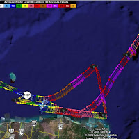
I found (via Google Earth Blog) that Tropical Atlantic have output data from the Hurricane hunters into Google Earth. I really don't like what they've done. Here's a screenshot:

Screenshot of the Google Earth track. Click to expand

I don't like:
Symbols: They've used the standard meterological symbol for wind which works when its on its own surrounded by empty space but when the symbols are packed together you can't differentiate them from one another nor work out what direction the wind is from easily.

Color:
The key is truly wierd, red denotes wind speeds of 30 - 35 and 50 - 55 knots

Icons:
The plane icon is way to busy, it should be a lot simpler and it is fixed with the screen so if you move the map so South is at the top the plane looks like its flying upside down.

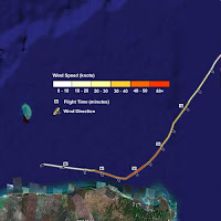
So I've mocked up an improvement:

Screenshot of my improved version. Click to expand

Wind Speed: I've introduced a better key, the color of the track denotes windspeed and I gave it a gray halo so that the color of the track is more visible. I could have just made the line a lot wider but this would have meant complications when lines cross.

Wind Direction: Small black marks with white halos denote wind direction (black with a white halo will stand out on any background). You could use mark length to denote wind speed but I think this would get messy when flight direction, wind direction and wind speed all changed at the same time. I also removed a lot of the marks, cutting down the number of symbols makes it a lot clearer. Of course you could always add them back in using the region function of Google Earth.

Flight Time Labels: These give you 3 sorts of information, you can see the relative speed of the flight, it gives you a sense of plane direction as well as the obvious flight time itself.

I haven't converted the whole track (and frankly, I'm not sure I've done it right now because the original was confusing) but I think you can see my points.

I'm going to review this whole project properly soon but thought I'd post this initial work now.

Thursday, July 17, 2008

DVD of Data Shipped to the Field

Earlier this month I posted about regions. One of the uses I noted for this feature of Google Earth was that Aid workers could be sent into the field with a DVD of data in a region. This would mean they would not need to be connected to the web to use Google Earth so long as they were only using it to view a small region (e.g. around a refugee camp).

To illustrate the point a bit further I've recorded a video from the region covered by Crisis in Dafur, click the image to view:


Via Ogle Earth I found this post from Johnathon Thompson of Aid Worker Daily discussing how Google Earth could be used in the field with a poor web connection. His suggestion was that Google should let countries or areas beyond where he is interested in be blanked out, this would reduce the bandwidth needed to view the areas he is interested in. Unfortunatly the idea doesn't work, blanking out countries only saves bandwidth when you are viewing areas at the highest altitude, there will still be a considerable need for bandwidth as you zoom in.

Explanation of the Image Pyramid: To understand this you need to understand the 'image pyramid' arrangement of how Google Earth (and all other eMaps/Virtual Globes) loads in data . Lets follow what happens as you fly closer to the ground in GE*:
  1. You start by flying to a postion above Myanmar where the on screen view you see represents 1000 km x 1000km. GE loads in image A to render the view, this image is 1000 x 1000 pixels (pixels = dots that make up the screen) in size. You are viewing an image where 1 pixel represent 1 km on the ground.
  2. Zoom in to view a 500km x 500km wide sub section of Myanmar and GE loads in a new image (B) to render the view, image A is unloaded. Image B is also 1000 x 1000 pixel in size. It differs from image A because one pixel of image 2 is 1/2km or 500m wide. As a result the on screen view is more detailed.
  3. Fly in further so the on screen view is 250km wide and GE unloads image B and loads in image C: it is also 1000x1000 pixels in size and in this even higher detail image 1 pixel represents 250m on the ground.
  4. Pan across to view the land area to the East of image C and GE loads in another 1000x1000 pixel image (D) to render the new region. Because you have flown no higher or lower the resolution of D = that of image C.
If you consider Johnathon's idea it would only impact the first view when we were looking at image A. Lets say we save downloading half the pixels of image A. However, as soon as we flew down into the country we would lose sight of all the other countries surrounding Myanmar so all the pixels making up images B, C and D, would still need to be downloaded in full. Note that all the images are the same size so image A only represents 25% of the total download GE needs, so applying Johnathon's idea we only avoid downloading 12.5% of the pixels.

Johnathon goes on to say:
"I have a heard a number of times that caching imagery is a viable solution to the bandwidth problem but the reality is that most folks have no idea how to cache imagery" (emphasis is mine)
Help is at Hand: Well that's OK Johnathon, data on a DVD can be easily arranged so that all the user in the field needs to be capable of is opening a Google Earth (KMZ) file. All you need is a techie like me to arrange it for you, DVDs with the KMZ could be copied multiple times and cached data spread to whoever needed it. With some programming work, the process could even be automated so that some non-techie on a good, cheap web connection could produce a DVD to be sent to the field pretty much at the click of a button.

He also says that:
"when the fabled ‘DVD full of imagery that gets shipped to the field’ solution comes up it takes about 30 seconds to convince the other person that it is really just a nice idea that has little basis in reality" (emphasis is mine)
Am I missing something? I'm not sure if that just refers to Aid Workers not being techies and not knowing how to cache data or if there is some other barrier to this idea I've missed? I've worked in Aid situations so I thoroughly understand that there can be no expectation of specialist GIS skills in Aid workers.

I am interested in pursuing this idea further, if anyone has a case study area they'd like to volunteer and ideas about funding I'd be happy to collaborate.

*This is a very simplified version of what actually happens in GE and I've made the numbers simple to make the point but it is broadly the way GE works.

Wednesday, July 16, 2008

Fly Google Earth with Card and Webcam


I saw this and immediatly thought that you could give a classroom of students a door sized symbol and get them to try and fly into some location in Google Earth. I'm waiting for it to come out of beta to play....

CamSpace via DigitalUrban

Appalachian Mountaintop Removal

Screen Shot of Appalachian Mountain Top Removal project

This week I review 'Appalachian Mountaintop Removal' (related site) which can be accessed by finding Global Awareness in the Layers column. I think it is an excellent use of Google Earth because topography (see [1] below) is a key part of understanding the issue, the purpose of the project is crystal clear and it links intelligently to all kinds of other web and Google Earth based materials if users require other details. My major criticisms are that the introduction is unclear and that use of sub layers in the Layers column would help users navigate more easily. That being said, overall it is one of my favorite Google Earth projects.

1. What do the users get out of looking at the project?

This project is an excellent use of Google Earth for two main reasons: the 3D topography is a key part of the story and the problem of mountain top removal is difficult to explain because before Google Earth it was very difficult to see the scale of the problem.

The basic idea of the site is to inform of the problem of mountain top removal in remote areas of the US. It is clear and simple. The project links well to a support web page where users can choose to get involved or donate.

2. Is there a good introduction?
There is an introduction and it leads users onto an introductory tour which is good. However, there are two conflicting placemarks 'Mine Site Overview' and 'User's Guide', it is not clear which is the proper introduction. It would be better to name one 'Introduction' and the other 'More information' since those labels better suit the content. The introduction also does not outline what users can access in the site which is a problem.

3. Is the text written concisely?
Fairly good, although there is some room for being more focussed. For an example see my attempt and editing some text from a placemark below, I think I capture the essence of the story in about half the words. The content I have edited out would be good to link to under some kind of 'more info' link.

4. Have icons, lines and areas been used well?
Yes pretty good. I like the flags in a blue circle placemark, they can be differentiated from each other nicely. A nice touch is the halo around the blue, it is both light and dark which means the icon can be differentiated from the background of Google Earth easily. Very smart.

However, I don't think much of the red target on a blue triangle. This is trying to say 'target mountain' however, it would be better to use something closer to the default mountain icon that Google Earth provides as it's unclear what the icon is trying to be.

Having said that, the unfilled square with an overlay icon in the corner is a nice design, immediately obvious that it is a flag for further content that the user can access.

5. Have acronyms been avoided?
Yes. None US users may not be aware of the state abbreviations but this may not be an audience the project is aimed at.

6. Is the Places column structured well?
No. They have chosen to rely only on screen navigation, this is a shame because it can help users to navigate the project. See USHMM: Crisis in Dafur also in 'Global Awareness' for a good example.

7. Is there an appropriate amount of data in the project?
Yes and they link to other sources without including them in the core project which is good. However, it would be nice if these links were flagged better i.e. there was a placemark that said something like 'further reading'. I think it is a little confusing that multiple further reading links are included in the placemark balloons, e.g. Glen Alum Mountain pop up balloon has 13 links, a simple balloon structure would have been better with the links collected in a dedicated placemark.

8. Have advanced elements been used that could be avoided?
I have a problem with the use of regions to hide the links to overlays. There should be some signal to the user when at altitude that there is content hidden there that they could zoom in on. See my post for details.

Otherwise the project is fairly simple.

9. Is there Map Junk?
No, in the main clean and clear. I think the placemark design is a little busy, e.g. the site graphic could be reduced in size but this is a small point.

10. On entry is the level of visible features appropriate?
Yes, further data is hidden from immediate view maintaining clarity.

Original (Marsh Fork Placemark)
Marsh Fork Elementary School in Sundial, West Virginia is located directly below the 2.8 billion gallon (yes, with a B) Shumate sludge impoundment on Cherry Pond Mountain, secured by a 385 foot tall earthen dam. Operated by a coal company, this ill-constructed sludge dam is one of West Virginia's largest and most dangerous, threatening the lives of 230 children each school day. According to a Mine Safety and Health Administration report, released under the Freedom of Information Act, this dam is leaking.Should the earthen dam of the Shumate impoundment ever be breached, there would be less than three minutes to evacuate the Marsh Fork Elementary School before the water at the school was 6 feet deep, and in only minutes more it would rise to over 15 feet. Residents of the community are particularly concerned because the emergency response plan calls for notification of school children and others at risk by bullhorn.

This coal company also operates a coal preparation plant about 200 feet from the school. Coal dust from the plant perpetually coats the school with a black film, which many residents complain is making their children sick. A geologist at Marshall University confirmed that there was coal dust in every air sample he took in and around the school.

Ed Wiley, whose 12-year-old granddaughter attends Marsh Fork, walked for 40 days from Charleston, WV, to Washington, DC, in August and September of 2006 to call attention to the plight of the children at Marsh Fork Elementary School. When he arrived in Washington, Ed held a news conference and met with Senator Robert Byrd to discuss Marsh Fork Elementary School. Despite Ed's reports that Senator Byrd "had tears in his eyes," and had promised to "leave no stones unturned," there has been no action to date on Ed's requests. Ed has formed an organization to raise money to build a new school called Pennies of Promise More about Ed's walk and the effort to move the school can be found on their website, or by contacting the community organization Coal River Mountain Watch .

My Version
Marsh Fork Elementary School in Sundial, West Virginia has 230 children and is located directly below a huge sludge impoundment (a kind of dam). According to a Mine report this dam is leaking, should it collapse there would be less than three minutes to evacuate the Marsh Fork Elementary School before the school was flooded.

The coal company that owns the sludge impoundment also operates a coal preparation plant about 200 feet from the school. Coal dust from the plant coats the school with a black film, a geologist at Marshall University confirmed that there was coal dust in every air sample he took in and around the school. Local residents think that it is making their children ill.

Ed Wiley, whose 12-year-old granddaughter attends Marsh Fork, walked for 40 days from Charleston, WV, to Washington, DC, in 2006 to call attention to the plight of the children. When he arrived in Washington, Ed met with Senator Robert Byrd to discuss the issue. Ed reported that Senator Byrd "had tears in his eyes," and had promised to "leave no stones unturned [to resolve the issue]" but there has been no action to date.

Ed has formed an organization to raise money to build a new school called Pennies of Promise More about Ed's walk and the effort to move the school can be found on their website, or by contacting the community organization Coal River Mountain Watch .

Thursday, July 10, 2008

Zakouma Ivory Wars and Cornwall Wildlife Trust

Last week I said this blog would be reviewing projects more projects, I also released a set of tutorials. One of the activities in the tutorials is that users review the design of two Google Earth projects and see how their thoughts line up with my own. So if you click the 'click here' button in the review activity you can read a review of both of the following projects:

Screen Shot of the Zakouma Project

Zakouma: Is still in the Google Earth Outreach Showcase, in my review I list a number of problems I have with it but, even if you disagree with some of my points, a lot of the links the project relies upon are now broken (hence the crosses in the above screen shot). I think Google Outreach and National Geographic should either remove it or get it improved and updated.


Screen Shot of the Cornwall Wildlife Trust

Cornwall Wildlife Trust: I'm a lot more complementary about this project which is also in the Google Earth Outreach Showcase but I still wonder if they should have used web pages rather than Google Earth to convey this information.

Friday, July 4, 2008

New Elearning Website

The release of the lesson plan yesterday, the web tutorial on Wednesday meant really I was wandering further from the stated aim of this blog: to discuss design of projects in Google Earth. So today's release is


A collection of educational materials connected with me. Its mainly focussed on Google Earth but also covers multimedia topics such as flash and simple multimedia for teaching. Its quite simple at the moment but I aim to be adding to it and at some point will probably make the jump to a more sophisticated content management system style.

So that's the last post in the special birthday blog week. Phew!

Thursday, July 3, 2008

Brahmaputra Flooding Lesson Plan

Day 4 of 'Release week' ...

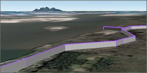
Screen shot from Google Earth of dykes by the Brahmaputra River

This is a lesson plan using Google Earth to explain the problems of flooding in the Brahmaputra river in India. Flooding has become more of an issue because of global warming and the lesson plan explores the reasons why and also explains the effects of the flooding.

1. Ice and Floods, Google Earth File

2. Effects of Flooding, Google Earth File

3. PDF instructions

It's been written in conjunction with Staff from the Brahmatwinn project who are studying the problem and Anne Sroksy Program tutor for Geography teaching here at Southampton University.

Points about teaching:
  • Designed principally for UK teachers but I've tried to make it useful for use in any country.
  • Its split in two to give a logical break to a lesson in case it gets over long.
  • I've designed it so it gives helpful tips on how to use Google Earth as you progress through the lesson. It assumes no advanced Google Earth skills on the part of the teacher.
  • Google Earth is particularly good in this context as it can be used to drape images over mountains, gives students a sense of orientation/scale automatically and plays videos in placemarks.
  • The plan is not prescriptive about whether Google Earth is used by the students or by the teacher in show and tell mode - either can be done.
  • I plan to do more lesson plans, feedback on how it works in practice would be really useful.
I also want to publish a video clip of Dr Craig Hutton who is very knowledgable about the project area introducing the issue of flooding in this area but that will have to wait awhile.

Wednesday, July 2, 2008

New Web Based Tutorial

Day 3 of the my blog birthday week, today's release is a set of web based tutorial materials teaching map design within Google Earth.

I have re-used a lot of the design principles from this blog in my University teaching about Google Earth and today I am releasing my teaching materials for people to use. The course is a web based and teaches users how to build a map based project in Google Earth (so, for example, there's nothing about the Google Earth search column). As you would expect from me it focuses less on the HowTo and more on the design principles of making a map:


Further Details:
  • Consulting: If you would like a customized version for your particular user group (e.g. a paper version) I am available to do so and can also deliver the teaching in a face to face format or tutor via an online course. My email is in my profile.
  • Creative Commons license: Which allows you to go ahead and just use it (in certain circumstances) without having to ask me.
Some pedagogical points:
  • Focused Content: The tutorial differs from Google's own tutorials and help files because I pick out the key facts and skills users need to learn; extra material can be accessed through 'further reading' links. Google's materials tend to be much more comprehensive (which is good in a way) but this forces users to make decisions about what they will absorb and what they will skip.
  • Video Tutorials: It incoporates the video tutorials I discussed yesterday - these will allow people to get the skills of how to create a basic map, in the later sections they learn how to use these tools to create a well designed map.
  • Not Paper Based: A lot of people still prefer paper based formats, I understand the reasons for this but have made my tutorial an online resource because it uses lots of hyperlinks, video and high quality color images and these are difficult/impossible in paper based materials.
  • Activities: The course provides lots of activities - it follows the constructivist theory of learning, if you want to use it as a teaching resource you must encourage your students to 'do' rather than just 'read'.

Tuesday, July 1, 2008

Review of Video Tutorial

I promised you a release each day, today's is an update of the video tutorials (link at the bottom of the page). This is quite a small release, the other 3 releases are bigger and I'm very excited to finally get to the point where I can release them.

Back to the review, its going to be about my video tutorials using the 10 questions I quoted yesterday. Reviewing your own work is always difficult because you're too close to it to see its flaws properly, however, using it in a practical with students recently I came to realise some of its flaws and how it could be improved.

1. What do the users get out of looking at the project?
I hope that they learn the basics of how to navigate in Google Earth and grasp the basic tools and processes needed to create a 'back of the envelope' type map.

2. Is there a good introduction?
I do explain exactly what the project without too much detail, however, the instructions on how to use the video tutorial bits comes later in the second part of the file (Tools: Watch me!). It would have been better to put both these parts together and the man with the flag is difficult to click because I have used a large icon size.

3. Is the text written concisely?
Yes, I think so.

4. Have icons, lines and areas been used well?
I struggled with this area because of the experimental nature of the project. A screen overlay would have served better for the main part of the tutorials instead of the ground overlay but I found I couldn't get the video icons to plot above the background image so was stuck with a ground overlay. However, I can't blame the experimental nature on the man with the flag at the start, it would have been much better to split the tutorial into two separate kmz files and get rid of that intro icon altogether.

5. Have acronyms been avoided?
Yes.

6. Is the Places column structured well?
Yes its as simple as possible.

7. Is there an appropriate amount of data in the project?
Yes. Tutorial material is endless, I worked hard to keep only the most important info in the project and linked out to the web using the 'more' icons if people wanted more information.

8. Have advanced elements been used that could be avoided?
The links within the pop up balloons taking the user to the next element were unnecessary, they aren't all that obvious and made navigating through the material complex. A better solution would be to split the file into 2 as described in Q4.

9. Is there Map Junk?
The man with the flag is unnecessary, a simple icon saying 'Read Me!' or 'Introduction' would have been better. The main background image in the 2nd part of the tutorials is fairly complex but I think it works and is necessary so that's not Map Junk.

10. On entry is the level of visible features appropriate?
Yes and I go further by using my 'picture frame' idea to further limit the amount of features users see at any one time.

I think the reflection above shows how easy it is to get sucked into using 'cool' features without properly asking yourself, does the clever way of doing that really deliver a good project?

Today's Release: A New improved version of the above without the flag man and without the 2 part structure:
Improved Video Tutorial File